When people search for a plumber online, it is usually because they have a problem. It could be a leak, a blockage, or an urgent repair that needs quick attention. In these moments, they want fast answers and clear help.
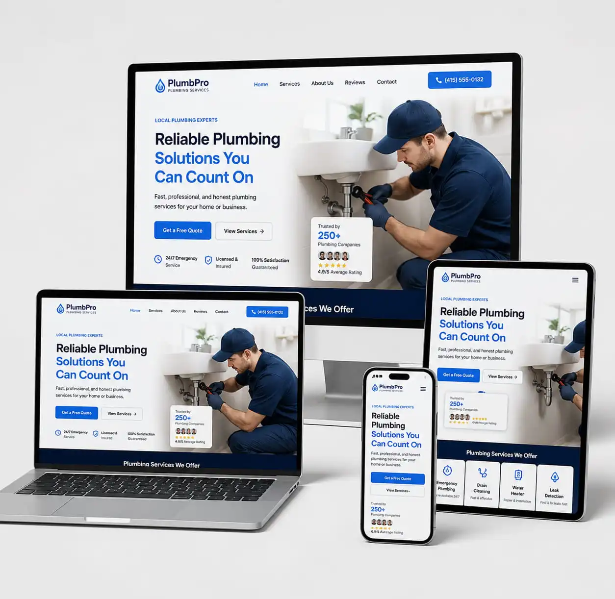
Many websites are built without proper website design for plumbers in mind, which makes the experience harder instead of easier. Slow pages, confusing layouts, and unclear information often frustrate users. This causes them to leave before they even understand the service.
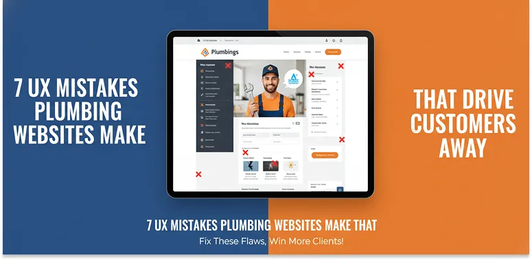
In this guide, we will explain the most common UX mistakes plumbing websites make. We will also show how these issues affect customers and how to fix them so your website becomes simple, helpful, and easy to use.
Why do plumbing websites lose customers without realizing it?
Many plumbing websites lose customers because of small UI and UX mistakes that create frustration and reduce trust.
Visitors often leave within seconds if a website feels slow, confusing, or difficult to use. Some common mistakes include:
- Confusing navigation
- Slow loading speed
- Poor mobile experience
- Weak call-to-actions
- Missing trust signals
- Complicated service pages
- Weak local SEO
- No clear emergency contact path
Below, we explain each plumbing website UX issue in detail and how it impacts conversions and customer bookings.
Poor Website Navigation That Confuses Visitors
When a plumbing website is hard to navigate, users leave quickly. They don’t waste time searching for basic information. Common issues:
- Too many menu items
- Confusing service names
- Hidden contact details
Good navigation should be simple, clear, and always make the “Call Now” option easy to find. If users feel lost, they choose another plumber.
Slow Loading Speed That Pushes Users Away
A slow website creates instant frustration, especially during emergencies. Even a few seconds can make users leave.
Slow speed usually comes from large images, poor hosting, or too many plugins. Fast websites feel more reliable and keep users engaged long enough to call or book a service.

Weak Mobile Experience That Loses Customers
Most people search for plumbers on their phones. If the mobile experience is poor, users leave immediately.
Every plumber needs a professional website because mobile users expect fast, simple, and easy access to information. Common mobile UX problems:
- Small text
- Hard-to-click buttons
- Long forms
- Slow loading pages
A mobile-friendly website should be fast, simple, and easy to use on all devices.
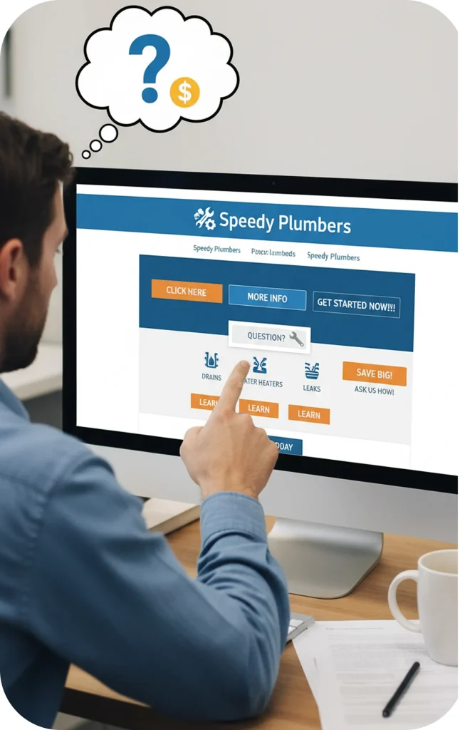
Unclear Call-to-Actions That Reduce Bookings
A CTA tells users what to do next. If it is unclear, users do nothing.
Many plumbing sites fail by using weak buttons like “Submit” or placing CTAs too far down the page.
Strong CTAs should always push users toward calling or booking immediately.
Lack of Trust Signals That Make Visitors Leave
Trust plays a major role in whether a visitor contacts a plumber or leaves the website.
Even if the service is high quality, a lack of visible trust signals can make it seem unreliable.
Important trust signals include reviews, real work photos, certifications, and experience or guarantees.
These elements help users feel confident and choose your service instead of leaving the site.
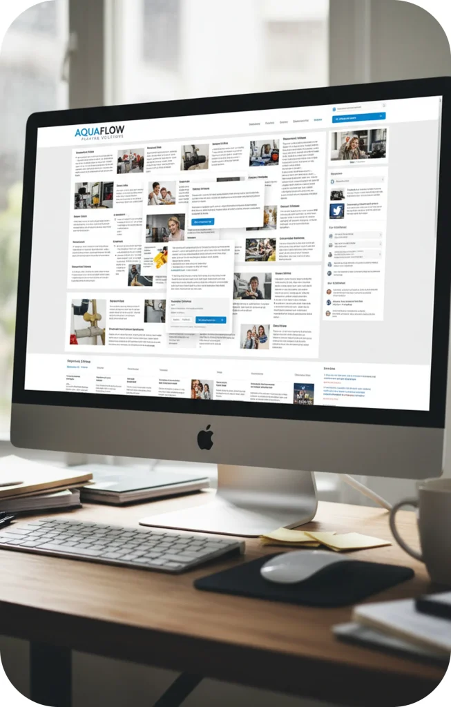
Overcomplicated Service Pages That Overwhelm Users
Some websites try to explain too much at once, which confuses visitors instead of helping them.
A better approach is simple: one service per page, short sections, and clear benefits.
Users should quickly understand what they get without reading long technical text.
Weak Local SEO Integration That Reduces Visibility
If people cannot find your website, it cannot generate leads. Local SEO is what connects plumbers to nearby customers.
Many websites miss city-based pages, have weak Google Business profiles, or lack location keywords.
Using SEO services for plumbers helps fix these issues and improves visibility in “plumber near me” searches.
Missing Emergency Conversion Paths
Emergency users want immediate help, not complicated forms or hidden contact details.
Important emergency features include:
- Sticky call buttons
- One-click calling
- Clear 24/7 messaging
- Short contact forms
The faster users can contact you, the higher the conversion rate.
Best UX Practices for High-Converting Plumbing Websites
Improving UX is not about redesigning everything—it is about removing friction. Every high-performing plumbing website must have:
- Simple, clean navigation
- Fast loading speeds on all devices
- Mobile-first design approach
- Clear and repeated call-to-actions
- Strong trust elements like reviews and certifications
- Easy-to-read service pages
- Local SEO optimization for visibility
- Dedicated emergency contact pathways
In addition, successful websites focus on guiding the user journey:
- Understand the problem quickly
- Provide reassurance through trust signals
- Offer a clear solution
- Make booking or calling effortless
Every second matters when a user is in need of plumbing services.
Conclusion
Most plumbing websites do not fail because of poor service, but because of poor user experience. Small UX mistakes, like slow-loading pages, confusing navigation, or unclear calls-to-action, can significantly reduce leads and bookings.
In a competitive local market, the difference between gaining or losing a customer often comes down to how easy it is for them to take action.
A high-performing plumbing website should focus on speed, simplicity, trust, and clear conversion paths. When these elements work together, the website becomes more than just an online presence. It becomes a reliable source of consistent business growth.